Multisigns logo - dark background

MULTI SIGNS

UI and UX focused website design, backed by SEO to help ensure Multi-Signs stand out in the market as a leader.

Overview

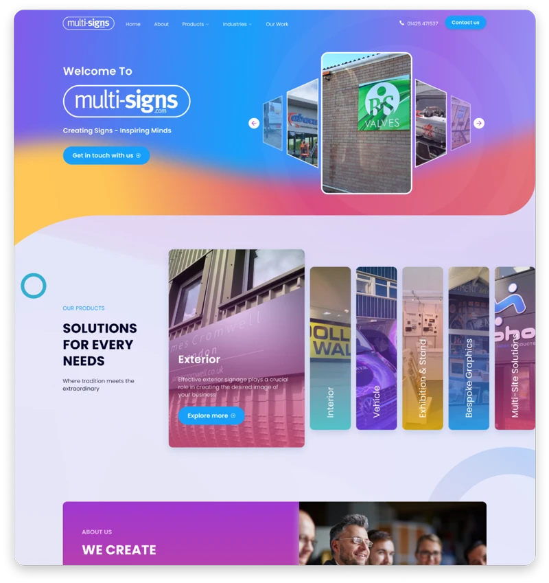
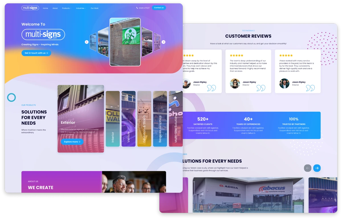
Atomic designed a visually stunning layout to ensure that customers could envision the brilliance of Multi-Signs’ work across all their services.
What we did:
Logo / Website design / Website development / UX/UI
Industry: Signs & Graphics
Location: United Kingdom
Multisigns layout
Introduction
Multi-Signs is a well established Signage & Graphics company based in Ringwood. Established in 1974 they offer a professional and personable service, taking care of business’ appearance and visual identities. Providing all aspects of signage from building and vehicle branding, way-finding and functional signage, industrial & office internal signage to bespoke items for members of the public.
MULTI SIGNS
Multisigns - Mobile view
OUR WORK

What We Did

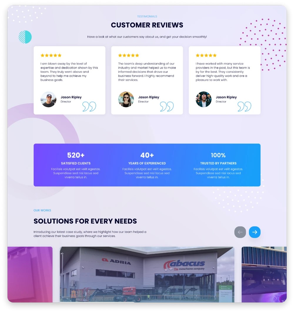
Atomic developed a visually striking new website with an enhanced user experience to boost lead generation. The design highlights Multi-Signs’ core services, focusing on their expertise in signage solutions. By incorporating social proof, the website demonstrates why Multi-Signs has successfully been in business for 50 years and continues to thrive. Testimonials and case studies are strategically placed to build trust and showcase the company’s long-standing reputation for quality. This improved user journey, combined with the emphasis on proven success, is aimed at attracting potential clients and reinforcing the credibility of Multi-Signs’ leading services.
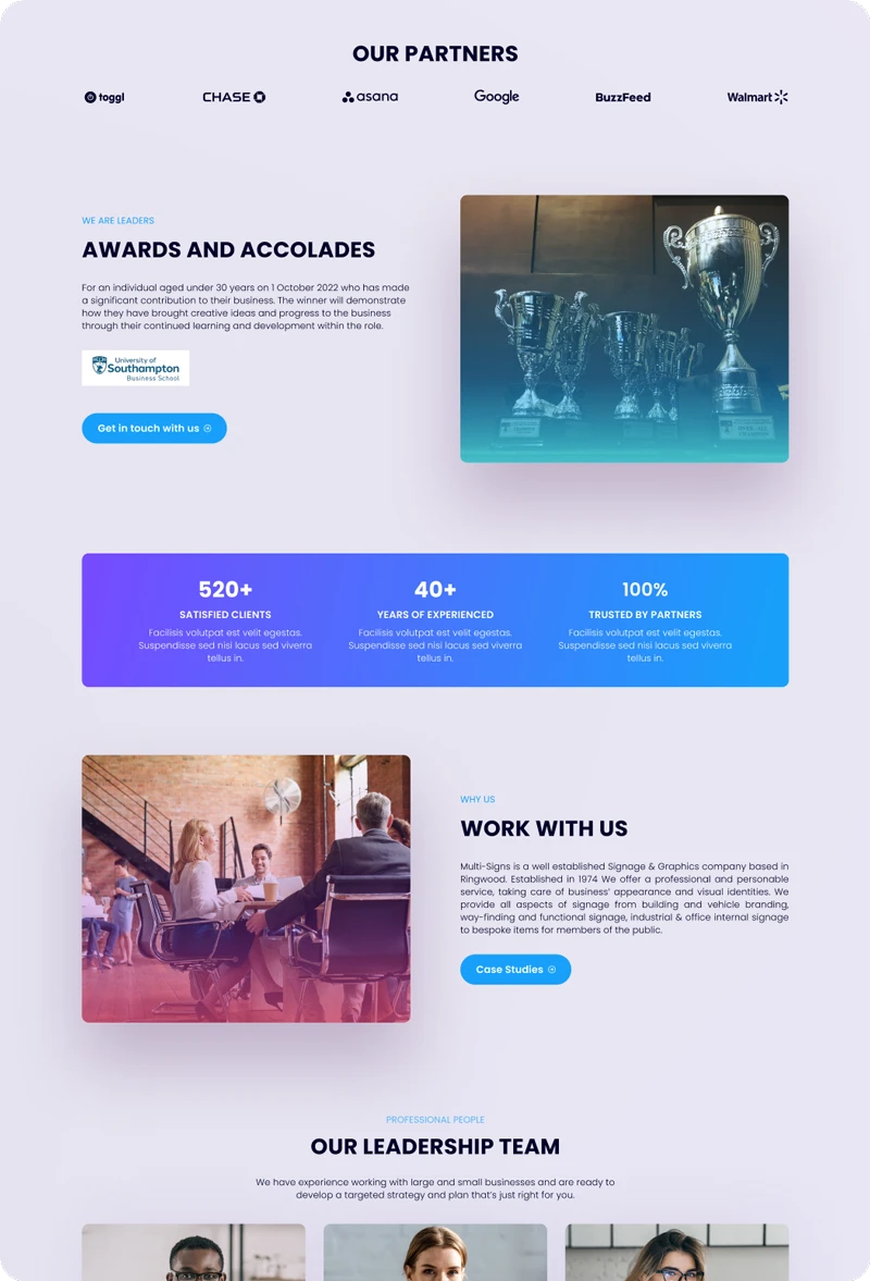
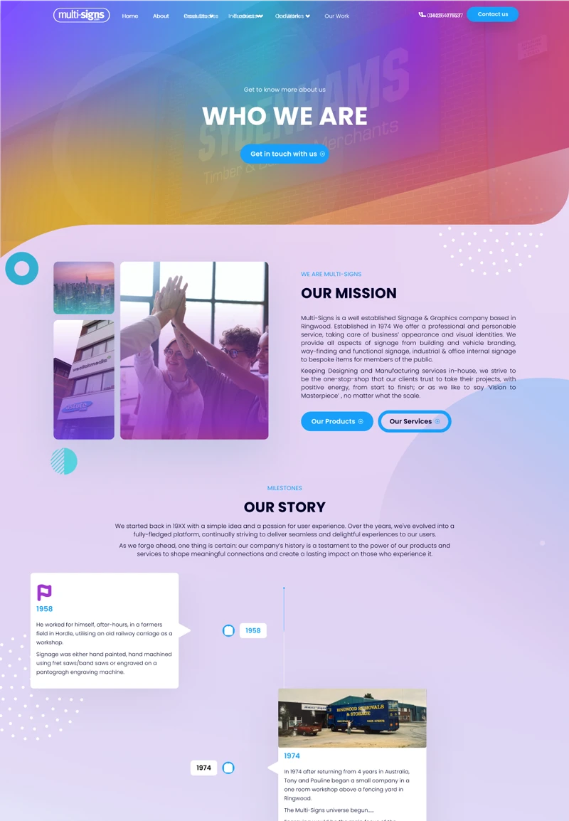
Multisigns Layout Homepage and reviews
Multisigns Layout Homepage
UX / UI

The Challenge

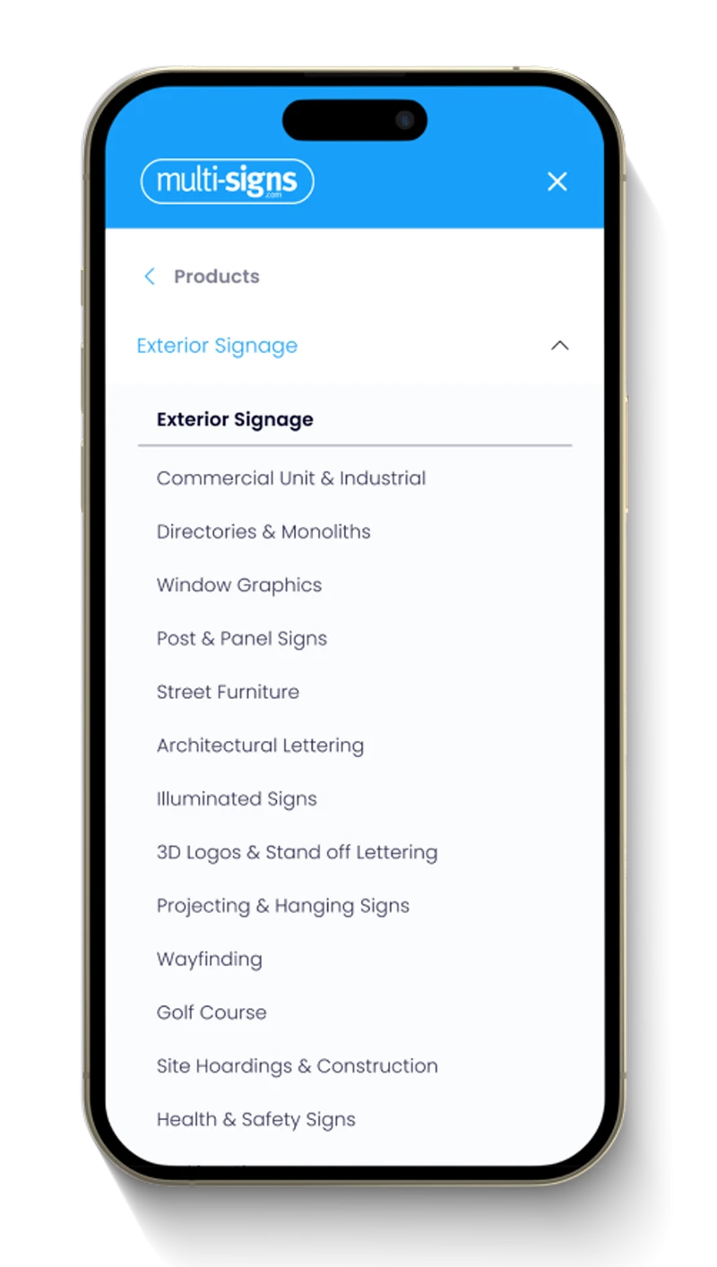
Multi-Signs approached Atomic requiring a significant upgrade of the UX and UI of the website to accurately reflect their business services. Multi-Signs boasted over 30 services, and the former website solely relied on the navigation bar for users to locate these services. However, each service page was severely lacking, displaying only images of past work without any content to enhance the user experience, thus detrimentally affecting their SEO.

The Solution

Atomic designed a new mega menu to enhance customer navigation and streamline access to services. Emphasising imagery and social proof, the menu highlights the quality of offerings and builds trust with potential customers. By showcasing testimonials and visual elements, Atomic aims to reinforce credibility and create a more engaging user experience. This thoughtful design is intended to not only improve ease of navigation but also to guide visitors towards signing up. The combination of appealing visuals and authentic customer feedback strengthens the overall brand presence, encouraging users to explore services and take action.
Multisigns Layout Reviews and Works
Multisigns Layout Homepage

THE RESULT

Result

Atomic has created a visually impressive new website with an improved user experience designed to drive lead generation. The site showcases Multi-Signs’ key services, with a strong focus on their expertise in signage. By incorporating social proof, the website highlights why Multi-Signs has remained successful for over 50 years. Customer testimonials and case studies were seamlessly integrated to build trust and demonstrate their long-standing reputation for quality. With a smoother user journey and an emphasis on their proven track record, the design aims to attract new clients for lead gerneration and reinforce Multi-Signs’ position as a leading industry provider.

Ready to start build your project with us?

We Grow Businesses Worldwide, Digitally.

Our Case Studies

Case Study

Beckett Boutique

United States

A professional and engaging website designed to showcase high-end retail and premium products in Shopify.

Case Study

ROYAL LYMINGTON YACHT CLUB

UK

Atomic delivered Royal Lymington Yacht Club a refreshed web design and logo to help them stand out from their competitors and help capture new Members across all ages.

Case Study

Wooflinks

Manchester, United Kingdom

Revamping Wooflinks: How Our Digital Marketing Agency Unleashed a Paw-some Web Transformation

Case Study

WARD GOODMAN

United Kingdom

Carefully crafted designs to showcase Ward Goodman’s expertise and drive lead generation in an extremely competitive market.
Ignite Your Digital Journey.

Get in touch with us

Ignite Your Digital Journey

Get in touch with us