4th October 2024
Posted by Matthew Carter
Responsive Website Design: Why it Matters and how to Implement
In this online world, any user wishes to have an effortless experience on a website, irrespective of which device is used. Websites are accessed today starting from tiny smart-phones to tablets, desktop computers coming in different screen sizes and resolutions. All these gave birth to the responsive design of websites and it is an important approach to making your site work and great-looking on all devices. In this blog, we are going to talk about why responsive website design matters and how to successfully do it.
Why Responsive Website Design is Important
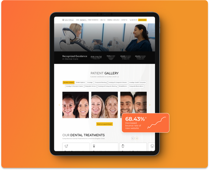
- Improved User Experience: User experience stands at the top of every website’s consideration list. A website that can adjust with ease to different screen sizes gives visitors a seamless and fluid browsing experience. Nobody wants to zoom into small text or distorted images when visiting a site on their phone. Responsive website design makes your site easy to navigate, read, and interact with, no matter what the device is. This is very important for bringing down the bounce rate and increasing user engagement, since users are likely to stay more on sites that offer a great experience.
- Increased Mobile Traffic: With more than half of the world’s web traffic coming from mobile devices, not having a responsive website costs you a great deal in missed audience. Even the search engines, like Google, use mobile-first indexing. That simply means Google takes the mobile version of your site as the priority, focusing more on it when ranking. If your website is not optimised for mobile, it may not rank well in search results, which severely limits visibility and can hurt your business.
- SEO Benefits: Google acknowledges above all that mobile users are becoming increasingly important, and a responsive design means improvement in your search engine ranking. Since you would need only one responsive website instead of having different desktop and mobile sites, this also means no duplication of content. Also, faster loading due to responsive optimisation can help improve your search ranking.
- Cost-Effective Maintenance: Having one responsive Website saves time, resources, and money from having to look after two different sites for desktop and mobile audiences. This simplifies your content management and reduces development time, as it consistently deploys your content across all platforms. Updates and changes can be made in one place, which is less time-consuming and less prone to error. In the long run, this reduces costs and makes managing your online presence much simpler.
Responsive Website Design: How to Do It
Now that we have established why responsive website design is important, let’s take a look at some steps in order to help you apply it to your own website.
- Use a Fluid Grid Layout: The fluid grid layout is the foundation for responsive design. Other than traditional fixed-width layouts, which have defined pixel sizes, a fluid grid will let the content resize according to screen size. That means elements on your page-image, text, and navigation menu-move and shrink depending on the device type. This kind of layout cannot be achieved without using CSS.
- Adding Media Queries: The media query is a very powerful tool in CSS that allows you to change styles depending on the device characteristics, such as, for example, screen width or resolution. For instance, you might want to change the font size, the layout, or the size of an image when on smaller screens. You can specify breakpoints with media queries and determine how to adapt the design into various screen sizes.
- Optimisation of Images and Media: It can severely slow down a site’s load time, especially on mobile devices where bandwidth may be at a premium. Ensure the best performance by utilising responsive image techniques such as setting images to a maximum width of 100%, allowing them to scale proportionally on smaller screens.
- Make Sure You Prioritise Mobile Usability: Responsive design is not just about your website looking good on different screens; it also includes usability. This would include things like button and navigation menu elements that should be touch-friendly-that is, large enough for easy tapping on a smaller screen. Also, it’s best to avoid using pop-ups or features that frustrate mobile users because they’re less likely to engage in anything too complicated through the interface of a phone or tablet.
- Device Testing: Finally, always test your responsive design through various devices and screen sizes to ensure everything works as it should. Utilising tools such as Chrome’s Developer Tools or online platforms like BrowserStack will enable you to see your site on different devices and screen resolutions. This way, your design will be truly responsive and assure the best user experience.
In a world driven by mobile devices, responsive website design isn’t an option but a requirement. Responsive website design ensures that your site functions on all devices by enhancing user experience, improving search engine optimisation, making life easier for you with regards to maintenance.
A responsive website is the foundation — but it needs the right traffic to perform. Our digital marketing services ensure your site is not only built for every device, but found by the right people across every channel.
Further Reading
View All PostsView All Posts

Statistics that Define Atomic
Impressions since we started 3 Years ago
Conversions across SEO, PPC & Social for our Clients
Average ROAS across our 100+ Global Clients on SEO, PPC & Social